
Well, the 2011 road season has officially begun, and it's my favorite time of the year!
...because all the PRO teams hit the streets in their new gear, and try to out-swag each other.
I'm not gonna lie, vaughters didn't call me and I am a little hurt, but I got my revenge in the end as his ass ugly kits came to light a few weeks ago.
...not that I hold a grudge.
Anyway, enough idle chatter-
Let's review!
(oh, if you can't tell i stole all the pics from cyclingfans.com, so thanks CF!)
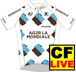
Ag2R:
not major changes from 2010, which is really a shame. Ag2R had a big opportunity here to fix all that was wrong with the brown shorts/white top motif they had going on for 2010. It's a sad look on frat boys everywhere, and a sad look on Ag2R as well.
Only frat boy mandals could make them look less PRO.
2 out of a possible 10.
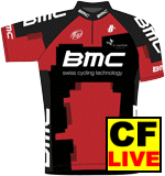
BMC:
although i tend not to be a fan of "urban camo", i don't hate this kit. maybe its seeing it alongside all the terrible-ness that is PRO kits this year... maybe it's Ballan's swag that makes up for the whole thing... who knows.
7 of 10.
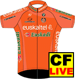
Euskaltel:
this kit has never been strong in the swag department, but with the folding of Credit Agricole it is now officially the most retro kit in the PRO peloton. and retro = pimp.
Euskaltel held fast in the fashion faux pas until cool came back around. good on ya.
8 of 10.
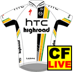
HTC:
HTC's tuffguy/galdiator/csc steez of 2010 is gone, and it's been replaced with some retro/milram-esque/hippy shit. not impressed. while it's well laid out and stuff, it is nowhere near groundbreaking, and it pretty weak coming from the worlds best/biggest/badassedest team. my only thought is that they must be driven by possible aftermarket Fred-sales.
weak sauce.
3 of 10.

Katusha:
this kit sucked hard last year.
they must have known it, because they are one of the few teams that stuck with the general idea of last seasons digs, but then actually improved it. that said, it's not 100% awesome. but maybe 2012 will knock it out of the park?
8 of 10.
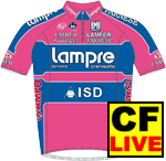
Lampre:
i'm really tempted to hate this...
but i can't. i just can't. like liquigas, they must have been feeling the pressure to wear some shit that wouldn't sear eyeballs for another season... but unlike liquigas, they didn't bow to the pressure this year. i can't say i approve of pink/blue, but they own that shit. and that's important.
9 of 10.

Liquigas:
WTF?
first to last homeboy. from first to last.
even basso can't make this look good.
0 of 10.
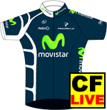
Movistar:
a lot of folks are trying to hate on this kit, but seriously; Movistar brought it.
two-tone collar?
non-symmetrical weird white graphics?
comicbooklook?
check. check. and mate.
imagine this with the longsleeve kit, knee warmers, and a bike painted to match... pure sex.
10 of 10.
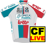
Lotto:
i don't know what is going on with lotto. for real.
i see what they are trying to do, but they failed. and even if they could do it right, i am not sure why they'd want to do that anyway.
2 of 10.
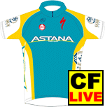
Astana:
whoop-dee-fucking-doo. 4 years later and still using the semi-custom template.
i wish they would all wear the Vino-face jerseys...
2 of 10.

Quick-Step:
This is a continuation of the departure from the old and impeccable quick-step kit. But is it a step down the ladder? my initial reaction was to try to hold in the vomit, but after seeing this kit in full (arm warmers, leg warmers, etc), WITH the uber-pimp painted-to-match Merckx bikes... I am sold. It's not a step up or down the ladder, it's a whole new ladder.
...(although it may be a ladder that Skil-Shimano has been on for a minute).
9 of 10.
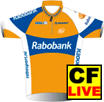
Rabobank:
sad.
they OWN these colors. and when you own colors as ugly as these, and you don't just go all out with them... well, you get a giant steez-fail. they needed some Mapei shit, and they created some first-class fred gear.
4 of 10.
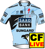
Saxo Bank:
this is a huge improvment over last year and the amazing fall from couture that was the CSC-to-Saxo transistion... maybe it was the Schlecks? They seem to have taken the bad ideas with them.
8 of 10.
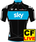
Sky.
i love a total package. and sky really has it. kits, bikes, busses, all screaming swag like an upper eastside trustfund chick during fashion week. yep, sky took her home.
10 of 10.
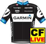
Garmin-Cervelo:
garmin's old kit was questionable, but the argyle worked and they owned it. cervelo test team had steez on lock. swag for days. styles for miles.
maybe i expected too much.
maybe sky did it first.
maybe the pressure was too great.
i was really looking forward to garmin-cervelo's lookbook with crazy thor looks on smash, and glamor dripping from everthing like steaksauce. A1.
too damn bad. though we was getting that butter knife. we got that arby's.
1 of 10.
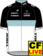
Team LeOpArD:
there is nothing to say about the style, because there is none.
0 of 10.
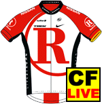
RadioShack:
honestly, i never realized that i liked radioshack's 2010 kits until i saw this.
...so i guess it's got that going for it.
3 of 10.
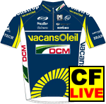
Vacansoleil:
not much in a departure from last season, i do like historical value. and while the colors aren't the best, they aren't bad.
i don't know what the dashed cirlce thing is all about, but it intrigues me.
this would be a background kit normally, but with all the teams moving to white or black, i think the teams that deviate will look good in the peloton.
8 of 10.
thanks for reading, bitches.


