
Hola amigos, been awhile since I rapped at ya.
Today though, I want to talk about kits! It is that time of year, and it just feels right.
Cycling kits are difficult beasts. With the historical factors, the current design sense, the look on the bike v. off the bike, the matchy-matchyness with the bike and other peripherals. It's a lot to cover, and some teams do well with it while others do not.
I haven't covered this topic in full since 2011, but if you want to reminisce (ie see if my predictions then turned out to be true), you can do so HERE.
Let's explore, shall we?
 I have hated on this kit in the past mainly because the brown shorts were terrible. Not that brown is so terrible in-and-of-itself, but that it just didn't transition well. Just made the kit look choppy and lopsided.
For 2014 the team has added more brown, specifically in the shoulders. This does a great job of tying the kit together, while keeping the look they've been working to build. And you know how I really love longevity and owning a look. Albeit weird geometric shapes as a look, but a look none-the-less.
I'm giving Ag2r the biggest jump of the year, and a good final grade in 2014.
7 of possible 10.
Astana

I do love the colors, while blue is still over-done in the peloton, Astana has a a unique take on it with the bright teal. But what they do with all the potential is just atrocious. They should just use whatever semi-custom template is available from their clothing provider.
0 out of a possible 10.
Belkin

It is ironic that the teams that are struggling to find enough sponsors to keep the team alive, are the ones with the real estate on the jerseys to make them look fantastic.
Classy take on a classic style. They nailed it last year, and did not deviate for 2014. Well done.
(I would give them a 9, but the team bike is a mess).
8 of a possible 10.
BMC

Now it seems very, been there/done that. Which isn't to say I don't like it, it's just not fresh anymore. Who could've predicted that urban camo would go out of style?
But, while not-so-fresh, it is consistant and still goes well with the bikes, and you guys know that the total package is important to me too.
Really, it's not a good thing when the National Champion kits in your line up are the best kits on the team.
6 of a possible 10.
FdJ

FdJ has alway done a great job with the kit, definite changes each year, but a very consistent theme over the years. It helps, of course, that they have had a long term sponsor that does not seem interested in sharing jersey space with any co-sponsors.
The switch from what was essentially an "away kit" in 2013, to the blue being the main kit for 2014 is bold. The peloton has been awash in a majority blue for years, and that has only just recently made a change to everyone wanting black kits. (Thanks, Cervelo Test Team).
Still steezy. Still clean. Not white.
8 of a possible 10.
Garmin

I am so conflicted on this kit. I like the front. A lot. I like the right side/white side on the back.
I think I would love this kit if the entire back was white with the one red stripe, and the front remained the same.
As a whole there are essentially 3 kits happening in this one kit, which makes for kind of a mess.
Sadly for Garmin, the sum of it's 3 good parts does not equal a whole good kit. :(
5 of a possible 10.
Lampre

And at the end of the day that is the point for the sponsors.
I also value the ownership Lampre have taken of the pink. No one can really step to it. They are the team with Flou Pink. Period.
The darker blue this season looks better, and hopefully won't dim the boldness of this kit much, and I'm not sure what to do with the green cuffs yet. I look forward to actually seeing how this one looks in the pack.
9 of a possible 10.
Lotto
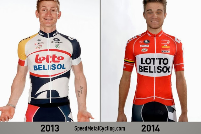
There was a lot to like about the 2013 Lotto kit. The shorts were great, the one red panel stood out while on the bike. And although it seems awkward, the yellow shoulder was maybe the number one best feature of any kit in 2013. Lotto is known for it's crushing leadout train for the Gorilla, and when the team was lined up and piling the hurt on the rest of the peloton, the yellow on the shoulder was dramatic. Google some footage. I'll wait.
Other than the weirdness on the 2013 belly area, it is a A+ kit. That didn't deter them though from the biggest kit change in the pack for 2014.
In what is clearly a "throw back" style kit, harkening back to the days of wool jerseys and black shorts. Lotto is going out on a limb in 2014.
I think the jersey works, it looks solid and clean. I like that they took the retro look as far as not even using the sponsors typeface(s). It's a bold statement.
I do miss the yellow shoulder. And I am not confident that the "black shorts" are actually black, and not dark blue which would ruin it. But red shorts would've been worse.
I want to see these in action, but for now:
6 of a possible 10
Movistar
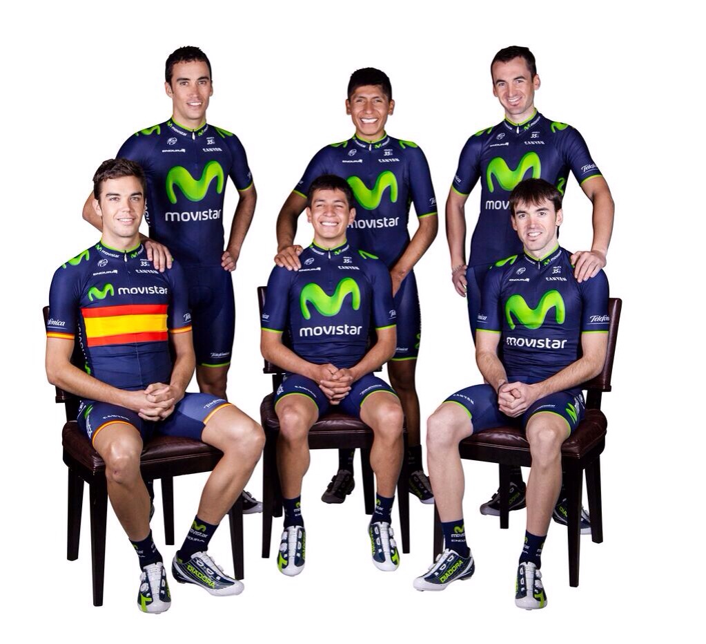
The only change is some green highlight to the collar and sleeves. These kits look fantastic on the bike, and Movistar take the total package branding seriously. (See custom colored shoes! omg.)
The bikes match, the arm and knee warmers always flow. This kit is a home run.
As and added perk, they do National Champions kits correctly.
10 of a possible 10.
Omega-Pharma

Although the move to black is an uninspired trend in the pro ranks at the moment, it is still a good move for them. Last year was that bad.
The kit itself is well put together, and consistant, and while it is a big change, still manages to remain recognizable as the same team from last year. (Something that will give Lotto fans a tough time!)
The inclusion of the riders twitter handle on the kit is becoming almost mandatory these days, but still not everyone is doing it, and it's still nerdy-cool.
6 of a possible 10.
Orica-Greenedge

This years kit is an improvement, but can I just say, if you made that white bit blue as well, it wouldn't it be a shitty version of the Movistar kit?
You guys have a giant budget, I know you can find a good designer. I know it.
3 of a possible 10.
Europcar

It isn't a great look, and it isn't really cutting edge design. But, for what it's worth, we won't see this one zipped up very often anyway.
2 of a possible 10.
Katusha

This is awful.
What the hell is that grey shit on the front?
What the hell is that tire track stuff on the back?
This is what happens when your team is owned by ex-KGB mafioso.
0 of a possible 10.
Sky

The 2014 kit gets a little more busy, with the side panels going to a new sponsor and no longer bearing the riders name. (Moved to the sleeve).
I am concerned about the amount of nipple we'll be subjected to during the summer months though...
This is still a pretty classy kit. As expected.
9 of a possible 10.
There you have it.
Cannondale, Saxo, and Argos (giant??), have yet to be released. Sorrrrray.


