

the good, the bad, and the urthel; local team kits unveiled!
professional review of proposed kits, and sage advice for those whose designs remain as-of-yet unseen!
onward to the goal of the best looking peloton in the country!
(cuz what else do we have, really).
welcome to (dis)ject(ed) runway!
(fyi; this is bound to start strong, and degenerate quickly into petty name calling, and pointless violence... like any good reality show!)
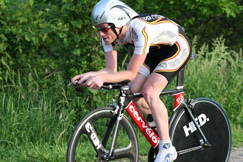
cat sex recently sprinkled the internets with a prototype 2008 jersey. let's review.

review: the prospective jersey is a far cry from last years theme of, "non-design as design". getting away from the black colored jersey opens the door for the rest of us to notice and make fun of the fact that they are wearing pearl izumi shorts, and the "no bibs on this team" rule in their team charter.
secondly, and on a more personal note, i think there is quite enough of this color in the peloton already. thank you very much.
advice: cat six... cat 6... 6 cats... sick cats... um... i got nothin'.
maybe some paw prints walking around would be cute?
crossniacs:

review: what the hell is a crossniac? if you go by the logo, it looks like a crossniac is a duck stealing a 10 speed bicycle...
but, that is what gives this kit it's flava.
it's hot in the hood. for reals.
advice: this kit is pretty classy. although, in "real life", (aka; a bike race), the gold is very bronze, or brown. next year demand gold. gold is rad.
don't let champion-sys ruin your stylin' kit...
we know they can, have you seen some of the other local kits they've done recently?
birchwood: 2008 kit still top secret.

review: n/a.
advice: don't be afraid. go back to pink.
flanders: '08 yet to be revealed.. but have you been in that shop? the kit hasn't changed in 35 years.


review: see? creepy.
advice: uh. none, i guess. ...now quit staring at me.
auc: uh... i'm not sure if they get new kits, or just use the first run still... i'll get back to you.
gopher wheelmen: i can't find a good photo of this kit... oh wait, here's one.

about this time of year, we wait patiently for the first gopher wheelmen to poke their heads out for the first training rides of the season... if they see their shadows though, it means 6 more seasons of rabobank kits.
advice: go purple, or go orange. but for the love of all things holy, don't do both.
synergy: kit unknown.

review: could it be the kit above? i hope so.
advice: call fpa, and tell him to drink 4 red bulls, put on minor threat album, and get rad with your kit.
rad.
like this;

or, this;

(it's like screaming at a wall... don't you fucking get it?)
hollywood/silver cycling: not yet seen. doubtful that it's changed. ...although, it
review: seem to be going the flanders route... to paraphrase; "same kit, different year".
advice: you should have grabbed the color silver for your kits while ya had the chance... lgr owns that shit now. booya.
not local, but;
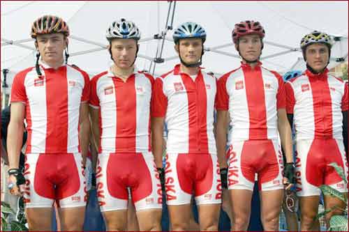
inferno (formerly a+f): 2008 team kit unleashed onto an unsuspecting world.

review: first to last. a shame. a damn shame. last years kit was one of the best ever.
if i was lucky (read: good) enough to race for a pro/semi-pro team with a kit like this, my first goal would be to win a national championship so i could wear a different kit.
advice: n/a. this kit is final, for better or worse.
lsc: will they look like this years csc kits? let us hope so!
here are some lsc styles from years past...


review: the original lsc jeresy has a retro appeal, a classy look, and a big duck.
the 1998 version is hideously terrible, gaudy, and really just down right trashy.
advice: go back to 1998!!!!!
midwest womens elite amateur womens cycling team and club:
[no photo]
review: this is a new, first-year team. what will they bring to the table? hopefully something with some verve.
advice: don't do blue. do anything but blue. oh, and don't do this. (although, it wouldn't be as much of an issue...).
tell you what, call fpa, tell him to drink 4 cups of green tea, put on a portishead album, and get rad.
...and to use greens. there is no green at all in the womens peloton.
but whatever you do, make it look tough. cuz you are gonna be a team to reckon with. no flowers or crap like that, ok?
best womens team kit ever?
this one.

tough as nails.
urthel:

review:thank god thats over. next!
lgr:
this just in! all-new for 2008!

we call it, "the astana".
you'll call it, "perfection".
speedstix:
hanz broke out the jersey at coldsprints #2, it was nice of them to let his kids play with photoshop and design the kit.
it takes alot of faith.
crosby also wore the new threads in action in canuckia.
and, it looks like the team leader's custom skinsuit has just arrived!

advice: hire a pro.


7 comments:
thanks for the props on the crossniacs kit. Our goal was full-on GOLD.. we are in the works of a warm-weather kit right now..debut to follow this summer
Wow.
That Baby One-sy will sure make a great skinsuit for the Speedstix team!
I'm not sure cyclists are actually the best judge of what colors look good together.
I'm not sure cyclists are actually the best judge of what colors look good together.
Truer words have never been spoken.
yellow in the collar and leg cuffs... BAD idea.. makes people look sick. clothing tip #1 in bike clothing design 101.. if it's not too late make a change..
but we are sick.
the sickest team around for sure.
what size one-sy will Taylor Olson need?
Post a Comment